
App design
Picspot
Picspot is a app tailored for both professional photographers and photography enthusiasts. This multifaceted tool serves as a comprehensive information hub with all the essential elements vital for photographers at any level. Its unique, location-centric features empower users to effortlessly plan their next photoshoot, with the ability to determine the most captivating locations. Picspot is the ultimate assistant for every photographer's creative journey, providing a seamless integration of practical resources and an innovative approach.
Date
March 2023 -- May 2023
Role
UX designer
Notable Tasks
Information Architecture
User interview
Wireframes, and Visual Design
Define
Problem
Picspot addresses the innate challenge photographers face in finding the ideal location for their shoots. Existing solutions, such as Instagram, Google Maps, and SunCalc.org, while somewhat helpful, scatter necessary information and lack objectivity, forcing photographers to piece together data from multiple sources, a time-consuming endeavor. In addition, they offer no space for photography-focused interaction and discussion. Picspot fills these gaps by providing a unified platform that brings together all relevant information, including location details, weather, accessibility, and photography-oriented reviews, while also fostering a community for photography enthusiasts to interact and collaborate.
User research
My research process consisted of two primary elements: observation and interviews. The observation phase allowed me to gain insights into users' existing habits and behaviors regarding how they search for and select photography locations. This involved assigning interviewees a task to plan a hypothetical photoshoot and observing their actions throughout the process.
The interviewing stage was comprehensive, involving identification of potential interviewees, question preparation, data collection, and analysis. This approach aimed to understand users' past experiences with similar apps and their expectations for Picspot. I interviewed four individuals in total, including two part-time photographers from my personal network and two individuals with an interest in landscape photography, one based in Washington DC and another from the Georgetown cohort. The DC-based participant was found through Instagram using specific landscape photography hashtags. This balanced mix of participants allowed for a holistic understanding of the user needs and experiences.
After I found my target audience for user research, I started to design the questions to understand the following points:

-
How do you determine photoshoot locations?
-
Where do you source information?
-
Any challenges in picking shoot locations?
-
What essential information aids location selection?
-
What do you expect from Picspot?
Data gathering and analysis
To effectively analyze the interview data, I employed card sorting, organizing responses into key categories: application scenarios, discovery methods for new spots, views on photography, and required functionalities. This method streamlined the complex data, facilitating a clearer understanding of user challenges and expectations. Such an organized and focused approach paved the way for a more user-centric design and robust solution.
Affinity map-- click to view more details
Based on user interview insights, I've developed two personas to represent my target users: Professional user Jimmy and Amateur user Monica. These personas provide deeper insights into our users' primary needs and their respective user journeys. Additionally, they clarify the specific information each user type most requires.
User persona-- Click to view more
Findings
Based on the user research, I've summarized the problems and pinpoints mentioned during the interviews:
-
Information is scattered across various sites and apps, necessitating users to refer to multiple platforms to gather the required details.
-
Certain important photographic information, such as camera and lens types, live crowd data, and weather conditions, is difficult to find using existing apps.

"Well, sometimes finding a spot is hard cuz I need to refer to everything."
"Location, transportation way, and weather are important to me."


"They can optionally add what cameras and one lens they're using."
How might we...
Now, after the research stage, the final question becomes clear:
"How might we help users by building a platform that gathers all the information they need and assists them in finding the best photo shooting spots?"
Develope
Research Analysis and user journey map
To analyze the research findings and ideate solutions more effectively, I've broken down the problem into several points:
Scattered
information
Users indicated they need the following details: transportation info, weather updates, sunrise/sunset timings, popular spots, camera specifics, map functions, and live crowd data.
This implies the necessity to establish a community platform that facilitates better sharing and communication among users.
Needs of recongnition
The user journey map will assist me in exploring how users will interact with Picspot and envisioning different scenarios of its use.

User journey map
User flow and site map
Once the fundamental content for the app was structured, I proceeded to devise a comprehensive sitemap. This crucial step served as the guiding framework for designing the user flow.

Sitemap
A user flow chart is a strategic tool that outlines the potential routes a user might navigate through Picspot to reach a specific objective. This process necessitates careful planning of the information architecture, wherein I determine the optimal display and organization of each information component within Picspot.
User flow 1: Account
Scenario 1: Existing user accidentally deleted the app and would like to log in with the reset app.
Scenario 2: The first time the user wants to register.
Scenario 3: The user wants to go straight to browse the content.


User flow 2:Map page
Scenario1: Users want to view posts and spots on the map page
Scenario 2: Users want to collect interested posts into their collections.
Scenario 3: Users want to interact with others.
User flow 3: New post
Scenario 1: write a new post about the spot
Scenario 2: share posts on social media

Design
Wireframe

I transitioned to constructing wireframes using the Figma. In an effort to optimize time and efficiency, I leveraged wireframe kits for the swift development of high-fidelity wireframes. This strategy resulted in a multitude of polished wireframes, ready for user testing, within minutes.
Highfi wireframe
UI Design
Color

Fonts

Product Demo
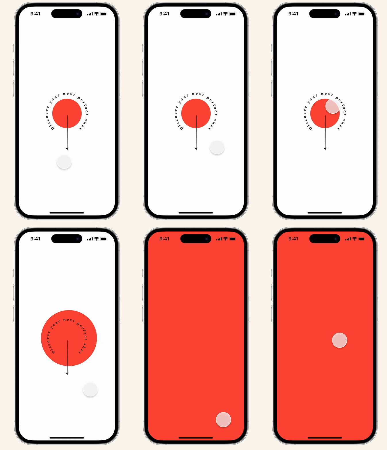
Splash and login
Vivid red invigorates the user experience. Users can access our platform via social media or email.
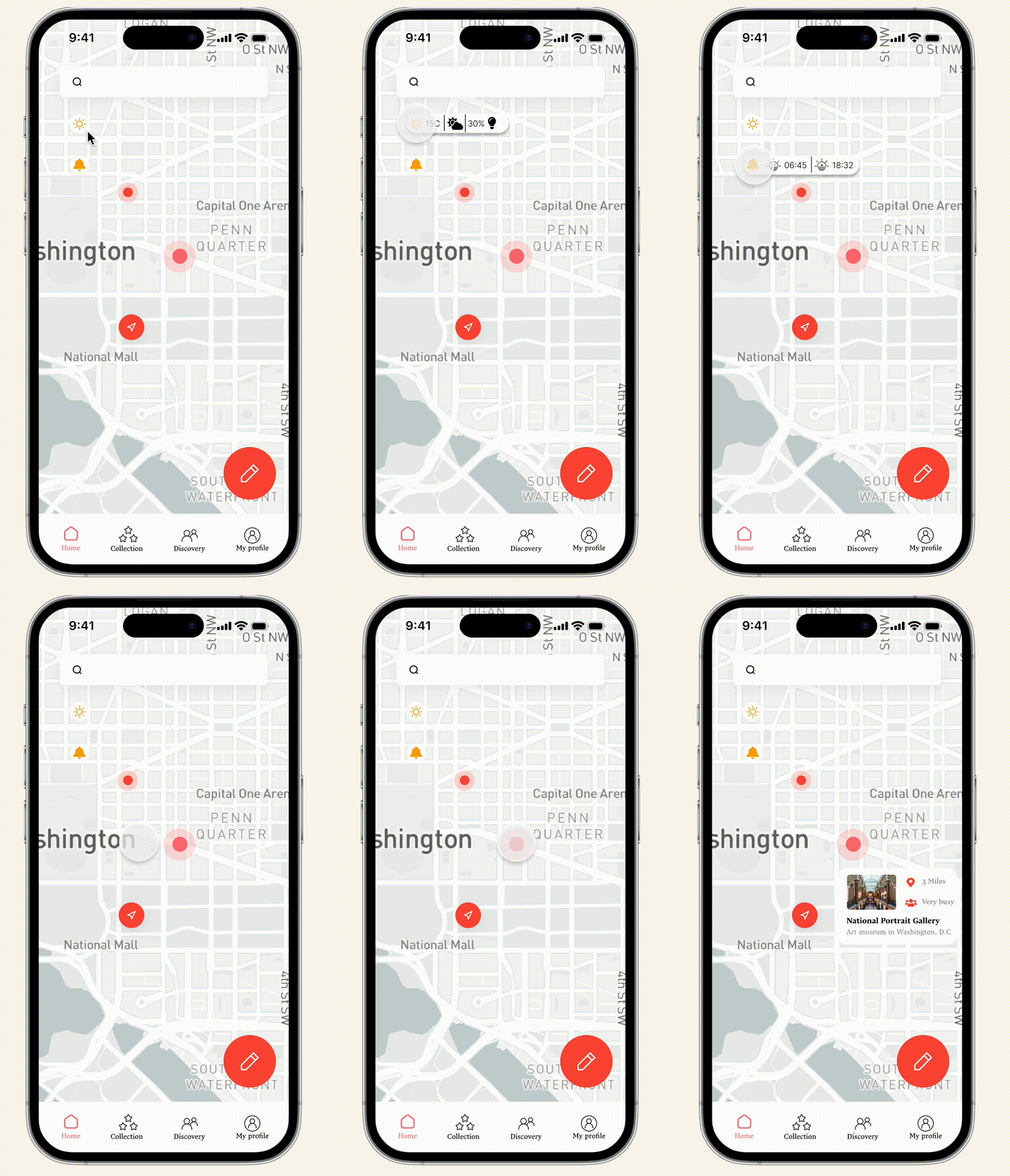
Home page
To make user approach the information they need, I set necessary information on the home page including weather, sunset sunrise time and live data.
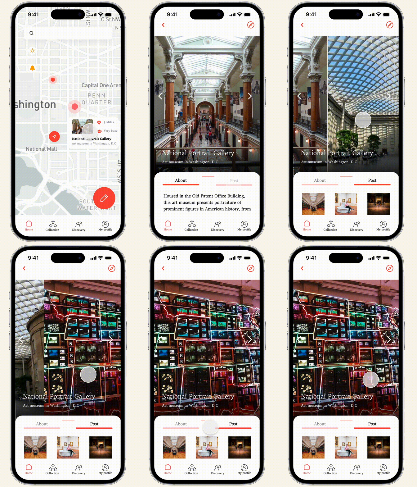
Spot information
The visual of spots information is fixated around photos, which I designed to make it like a slider. The tab bar can help user to view more content.
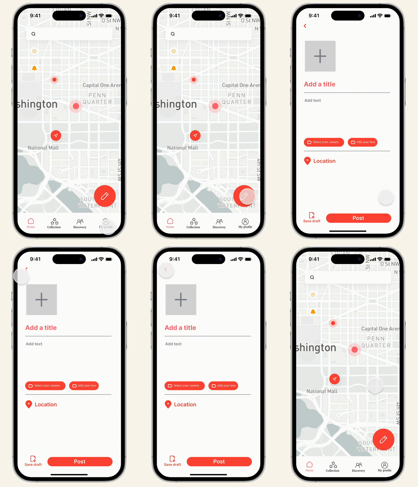
New post
In order to encourage users to express their thoughts, I designed a red button on the right corner, which is the most convenient spot for the user.
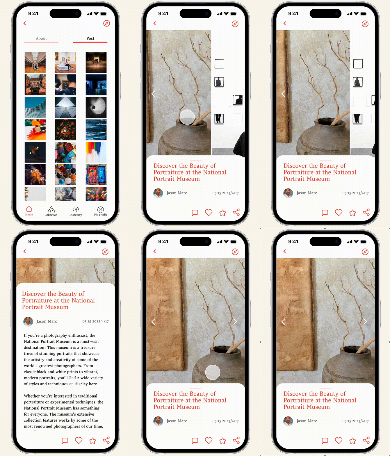
Post
As a photo-centric app, how to help user to display their photography works is essential. I designed the tap bar to help user to drag the content and the label to tag the camera and lens.

Profile
Where is my next stop?
The collection board will tell you to go.
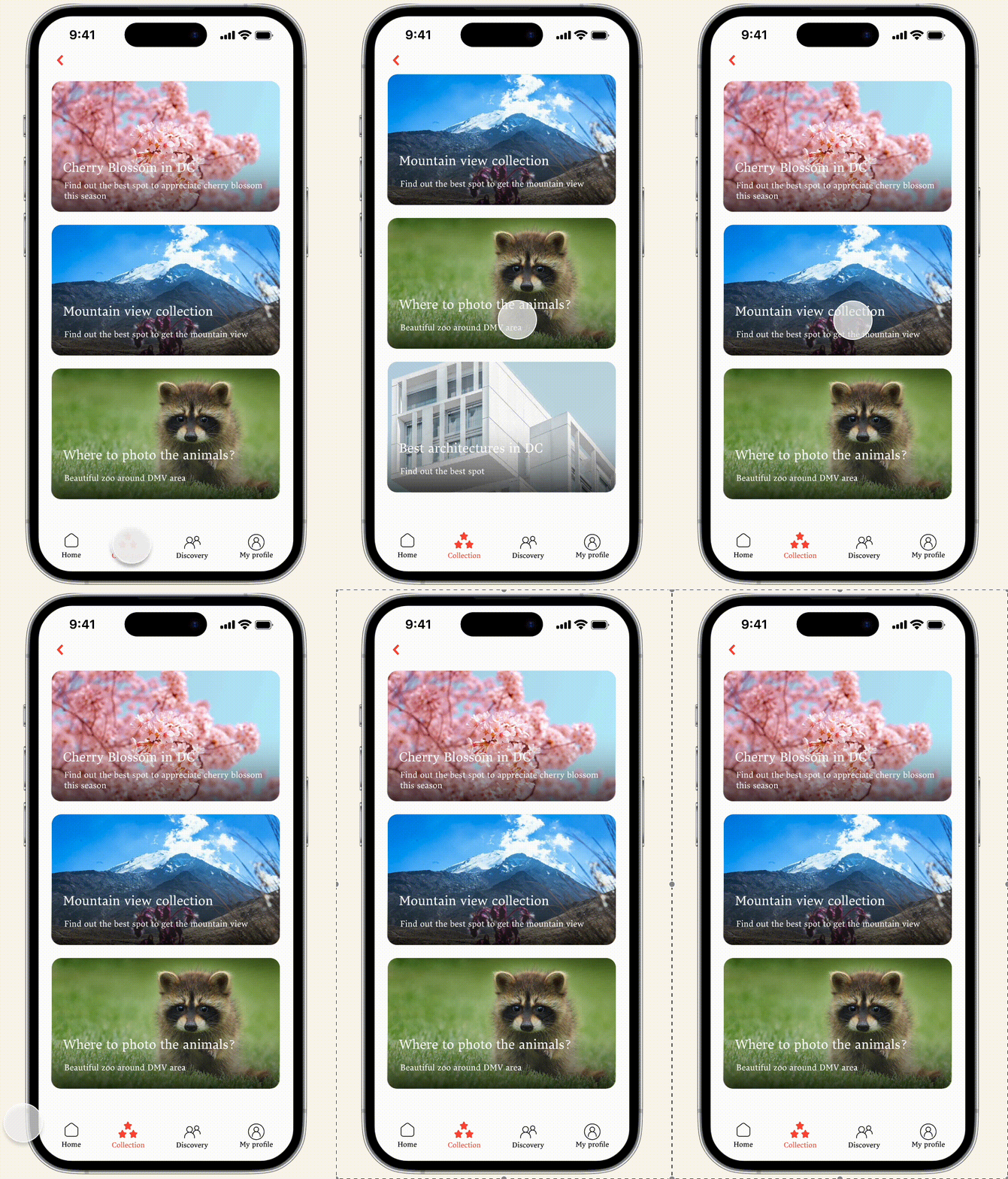
Collection
The collection page is an app-generated part of Picspot. To help the user to better get to know some hidden gems and to make information more cohesive, collection page is necessary.
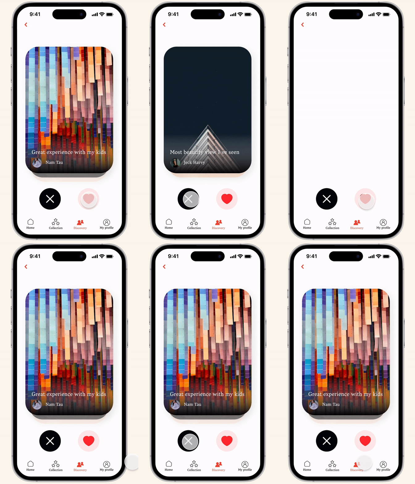
Discovery
The Discovery page serves as a playground for users, a space where they can explore and uncover areas that pique their interest.
Takeaway & Reflection
-
This was my first complete individual UX design case. The experience allowed me to understand the standard process of UX design, from conception to final implementation. One of the key skills I learned was how to source interviewees for user research independently.
-
Through this project, I enhanced my prototyping skills and truly understood the essence of user-centric design. It required me to fully empathize with users, viewing the design through their perspective. For instance, I didn't initially include a touch tab on the page until user testing revealed its necessity.
-
This project also emphasized the importance of continuous improvement in UX design. Sometimes users might not explicitly identify issues, but their overall experience can be optimized. It is our role as UX designers to recognize these opportunities and find ways to enhance user experience even further.

